http://www.youtube.com/watch?v=RiNvjXzzvAk
Wednesday, December 2, 2009
Class Portfolio
Here is a video I put together for the Class Portfolio. All of the projects that I have done in class with a two extra that I put together in the past few weeks. Before every project is shown there is adescription of what you are going to see. ENJOY! Sorry you have to go to youtube for this but it's the only way it would allow me to put the video on here.
Saturday, November 14, 2009
Tuesday, November 10, 2009
Project #5


Started working on the project. This is what I got so far.
Blue Eye: The world. Stands for everyone looking out to see what is happening in society.
Face: Stands for society & the economy. As it weakens it starts to crack and it's hard to support anything without society and the economy being stable.
Peace Fingers: Bad things in the world. War, dictators, economic downturn, destruction of life, and destruction of cities. All of this is laid over the peace fingers. The reason that they are in here is to show and for people to realize what should change for future world peace.
Hat: Has clouds layed over the hat, a woman tearing in the right top corner, a wall of missed soldiers with a soldier with his head down a peace pigeon in the middle woman crying in the middle to the left near the left finger and missing soldier gun and helmet. The meaning behind this is to show the sorrow that people feel when there isn't world peace.
NEW VIDEO of PROJECT!
NEWER VIDEO OF PROJECT WITH SOME MUSIC!
http://www.youtube.com/watch?v=bhCN5MNtW9A
http://www.youtube.com/watch?v=bhCN5MNtW9A
Wednesday, October 28, 2009
Project #4 Wallpaper!

Finished my wallpaper! Took a look at Virgil Marti's wallpaper projects and they gave me some ideas. I also took a look at other pop wallpaper. I tried to include files of the process of the final product but they were taking way too long to open up in photoshop. These files take so long to upload to here! I had to make the image size smaller it is now 8x23 but I still have the 24x64 file for print.
Blogger wouldn't allow me to download any bigger file
Friday, October 16, 2009
Project #3: Page layout

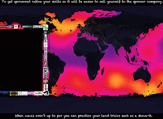
This is the layout for all the pages that are going to have a collage. On the top and bottom black bars there will be facts about skimboarding. In the right black column where the logos are there will be a short description of the skim comp. The white background will eventually change to a different more design oriented background.
Project #3: 2nd page
Thursday, October 15, 2009
Project #3: 1st Page
Project #3: Front Cover
Project #3 My Idea
Alright everyone, here is my idea for the 3rd project:
My idea is to make a collage book of skimboarding competitions that I've been to over the years. The book will be about 14 or so pages. The pages with the collages on them will have the name of the skimboard contest at the top along with a background image such as carbon fiber, splash, american flag, etc. On the right side of a page there will be a box where I will have information about the contest. The outline of the box will be of skimboarding manufactures and companies that are in the skimboarding world.
As far as the front cover and back cover goes. I plan on making the book like we did in class the other day with the front cover having paper pasted to the cardboard with my front cover design and then have the cloth draped over the edges to make sure you can see the cover design. The back will be done the same except the cloth edges will be draped over stickers that I have from skimboarding contests.
The binding will be of hemp string instead of the thread that we used in class.
Monday, October 5, 2009
Project #3


Project #3 includes looking at artists books, ideas of books, book arts and the structure of a book as an object. We also have to look at 5 artists that interest me.
Olafur Eliasson - 5th PHOTO: Born in Copenhagen in 1967. Along with creating laser cut designs in books Eliasson also created digital effects of images and many sculptures. His work is very interesting and it keeps you looking at the piece.
Brian Dettmer - 4th PHOTO: Very interesting on how he cuts into his books to make his designs. His designs are very intricately designed and not all of his pieces are of books. I noticed that one of his pieces was a scull, but most of them are of old dictionaries. Very cool artist!
Georgia Russell - 3rd PHOTO: Almost all of her pieces of art have a book involved that is slashed and gashed with strands of papers hanging off the books. She also paints parts of the book to change up her designs. She is also scottish who not only slashes books but also photographs, maps and newspapers. I wish to know what tools she uses to do this.
Thomas Allen - 2nd PHOTO: Although he isn't a book artist he does photograph books. In his pieces he isn't just creating one piece of art, photography but he is also creating another kind of art, book art. He cuts figures out of paper back books and folds them to create dioramas.
Casey Curran - 1st PHOTO: Crazy cool book artist. Along with Dettmer, Curran also slices into books that he buys a book stores. He uses a lot of different methods in his designs. If you look at his works you notice that he uses circles in every one of his works.
Tuesday, September 22, 2009
Robert Rauschenberg


Honestly, the only reasons that I picked this artist over the other artists are, first because of his last name, "Rauschenberg," and the fact that he uses the same ideas in every one of his works but uses different materials. These materials consist of cars, sculptures, electronic photos, bicycles, paper, etc.
Rauschenberg abstract art seems to concentrate on the real world around us.
The first and third photos are of Rauschenberg's work on canvas. Added to these canvases are birds. One being a Chicken and the other being a hawk or falcon.
The first painting seems very vibrant and full of life. The chicken on the top seems to tell me that there is a message trying to be conveyed. I'm not sure what this message is but if I were to guess I'd say the hectic life of a chicken lol.
The second photograph is a real car that apparently Rauschenberg painted himself. I feel that it is very abstract along with every other piece of works he has done. The designs on it are very odd and every time I look at it I see something different. However, on other parts of the car there are different portraits that convey messages. Many of these messages I believe are intertwined.
The third painting is very gloomy but keeps with his abstract designs he shows in all of his works. Very weird painting. I keep wanting to look at the bird but pulling your eye away you can see other parts of the painting that are just as important and interesting. You don't know what they are but as you look at them you think in your head as what you think they could be.
Sunday, September 20, 2009
Second project


I've been working on this for a lil bit. I'm pretty sure it is finished but not sure yet.
I am planning on messing around with this design a bit more in the next few days. Stay tuned to find the outcome, bad or good!
The first picture is the last "Forever" design that I have created. The last picture is the first "Forever" Design that I have created.
BTW the quote that I used for this project is by James Dean. "Dream as if you'll live forever, live as if you'll die today."
Sunday, September 13, 2009
Adobe Creation


For class I had to incorporate 1-10 of the textures that I posted up a week ago along with a picture of a sculpture my classmates and I came up with. This is what I decided to make on photoshop.
We also had to include 2 tips. One tip from Photoshop and another from Illustrator. Here they are:
Photoshop: Putting an image inside another image
- Have tow windows open: One with your portrait photo and another with your texture or scene photo.
- Use the rectangular marque tool to border your texture photo then go to "Edit" "Copy".
- While on your portrait image pull up your "Channel" pallet in the pallet menu. Then command/click on any of the channels.
- While on your portrait photo go to "Edit" "Paste into".
- Your image should now be complete!
Illustrator: Changing Fonts
- Got to "Type" on your guide bar.
- Click "Font"
- Choose what font you would like to use.
1st Picture: Includes the statue. Used the magnetic lasso tool to Highlight the areas that I changed such as the background which I used a Gradient Map to change the colors. I also used the magnetic lasso tool to edit the glasses, nose, finger and stick thing. I used my flower, crystal, metal, and griptape textures. I also blended the brick and wood to overlay the image.
2nd Picture: I did everything as I did the first picture but didn't include the wood.
Subscribe to:
Posts (Atom)


